Drupal Components
This page covers some of Drupal’s core and contributed components that provide site functionality, determine the site’s appearance, help organize content and metadata, and so on.
Modules
As noted on previous pages, modules are pieces of software that either ship with Drupal core or are contributed by third-party developers and institutions to extend Drupal’s functionality. The RC site relies on a number of contributed modules (and it is in fact these modules that drive the development of Drupal forward: the now-essential core Views module started as a contributed module). A quick description of a several important contributed modules installed on the site may be useful here, as the functionalities provided by these modules will reappear later in this guide:
- Asset Injector: Provides a UI interfact (through “Configuration”) where site CSS and JS can be both edited and targeted to specific parts of the site.
- Feeds: A related group of 3 modules that enable the site to import feeds and, vitally, to parse them using XPath. This functionality allows us to import content in large batches, and have XML/HTML tags auto-populate fields on each imported node.
- Geofield/Leaflet: enables mapping and map layers.
- Colorbox/Ng_lightbox: enables “pop-up” functionality on certain paths, configurable through ng_lightbox.
- Layout Builder Styles: allows block-level elements to be formatted using custom CSS; see “Layout Builder” section below.
- Google Analytics/Megatag: provides SEO for the site, allowing Google search to index the site and optimizing that indexing.
- Pathauto: auto-generates URL aliases for nodes based on configurable patterns.
- Views Slideshow: powers the slideshow functionality on the RC homepage.
Contributed modules must be installed via Composer (dependency manager) and are stored in the site’s codebase at docroot/modules/contrib. See the Composer documentation for more information on installing and removing modules.
Views
By far the most important and powerful feature provided by Drupal. So much so that it gets its own page. See using Drupal Views.
Feeds
For standard production use of the feeds module, see the Content Import guide in the Production Documentation. For instructions on how to configure a new feed and/or edit an existing feed, see the Drupal Feeds guide that follows.
Themes
Themes control the appearance of Drupal and can be found under the admin “Appearance” tab. Two separate themes are active, or set to “Default,” at any time: a standard “front-end” theme, which controls what visitors to the site see, and an “admin” theme, which controls the appearance of the admin UI toolbars and menus.
As of Drupal 9.5, the default themes that ship with core are Olivero (front-end) and Claro (admin). The RC rebuild adopted a robust, well-maintained 3rd-party theme, DXPR, which requires another contributed theme, Bootstrap (3), to function. Both contributed themes are updated and maintained through Composer dependencies; for more on Composer and updates, see the Composer documentation. The code for contributed themes can be found in the site’s codebase at docroot/themes/contrib.
Layout Builder, Blocks, Templates
The Layout Builder, which is a new addition to Drupal core, is a powerful tool to structure content on a page. The Layout Builder allows you to determine how, and vitally where, the fields for each node appear on the page. It also allows you to add elements that aren’t contained in a node’s fields in the form of Blocks and Views.
Generally any non-field “Layout” work occurs around the borders of a content page, which will of course display your node (field) content (the exception being the home page and section pages, which are all Layout Builder elements). Elements added “around” node content, which often persists across multiple content pages in the form of a sidebar, etc., are usually Blocks, which is Drupal lingo for a container that holds/presents a definable page element. A block can be configured to display HTML content (such as text or an image), or can even be “filled” using the output from a View. Blocks (or their associated Views) can be edited directly from Layout Builder using the “Configure” option from the contextual link.
The functionality of Layout Builder is surprisingly intuitive; the best way to familiarize yourself with its use is to click on the “Layout” admin tab on any page and poke around using Drupal’s contextual links (little “pen” buttons). For a use case tutorial, see the “Custom TOC” section of the TOC guide in the Production Documentation.
For hands-on demo of these components, see a walkthrough for content creation involving the Layout Builder, a Views block, and image style options in the Media & Mapping section of this documentation under the “Image Styles” section.
Templates. Layout Builder allows the building of templates that are applied to all new nodes of a certain content type; for example, all new “Praxis Publication” (index) pages default to a template that includes a Block that displays a View to auto-generate that volume’s TOC from the titles of all essay nodes that designate the TOC page’s node number as their “parent volume.” Fortunately, the Template Builder defaults to editing only the page layout at hand. To edit the template for all nodes of a content type, click “Edit the template for all” option that appears when you open Layout Builder (by clicking “Layout” on a node).
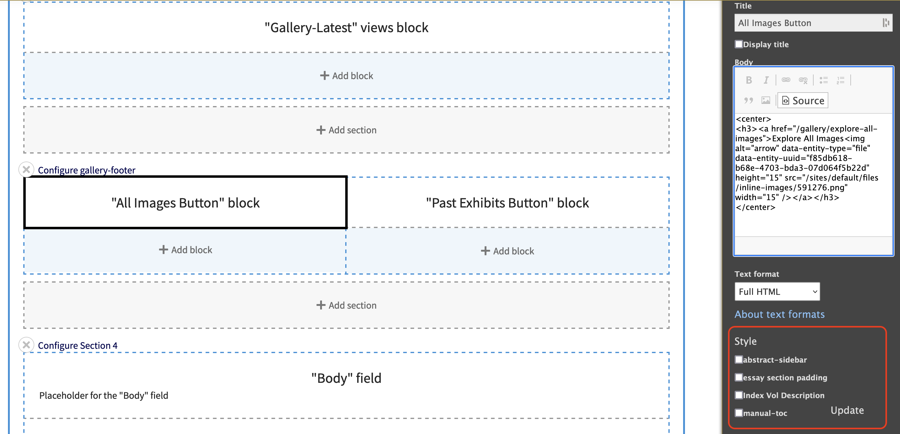
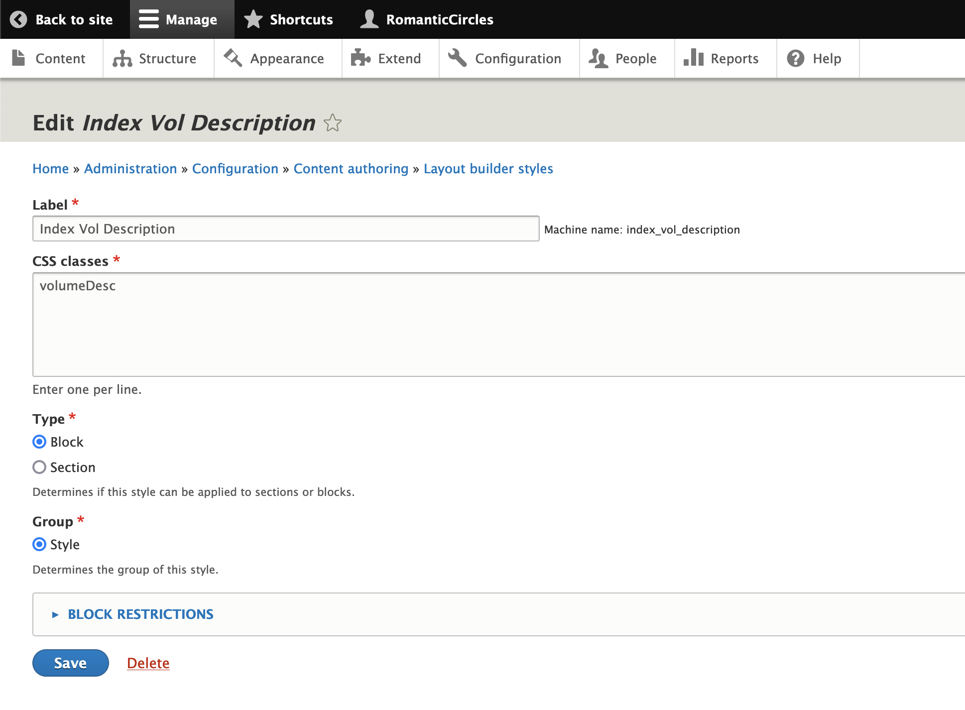
We’ve extended through a contributed module to add CSS classes to any layout element; see Layout Builder Styles module documentation. When you configure a Block using Layout Builder, you’ll see style options with selector boxes; each corresponds to a CSS class or classes. To inspect these existing CSS block styles, or to add your own, navigate to
Configuration / Layout Builder Styles. In the “CSS Classes” configuration box, you’ll just add the name of a class; you then have to add that class to a CSS injector (Configuration / Asset Injector / CSS) and define it. See the Assets section for using the Asset Injectors. The first image below shows the “Styles” options that appear when you “Configure” a block from the Layout Builder; the second image shows the admin page to configure the styles via a simple CSS class name.
Taxonomy
Drupal core includes a robust Taxonomy system that manages all metadata fields and tags used across the site (all content types). Navigate to Structure / Taxonomy to access it.
The logic here is pretty straightforward:
- Vocabularies allow you to sort metadata tags into useful categories, such as “people,” “places,” and “tags”; and
- Terms are individual taxonomic entries, corresponding to a name, an idea, etc., whose use, if the term is entered in a node field, can be tracked across the site.
Terms that exist in the Taxonomy system will auto-populate by suggestion in relevant fields in the Drupal backend (via Entity Reference). New terms (or vocabularies) can be created, of course, from inside the Taxonomy system.
A note about tags. On the D7 site, RC simply allowed authors to generate their own tags (“terms”) for each essay. While practical, this led to vocabulary “sprawl” that essentially made all tags useless since most tags only had one instance on the site. We’re now providing authors with a list of acceptable tags, which can be found under the Contributor Resources below (Tagging Options). Authors/editors can petition to add new tags, but as much as possible they should stick to the list so that tags remain useful.